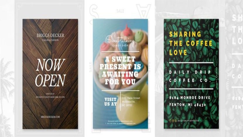
Our 5 Basic Pointers to Creating an Effective Business Flyer
Posted on 23/05/2017 EMHEDITOR Posted in POSTERSFlyers can be a cheap and effective way to advertise your business or event either in print or online. Sadly quite a number of business owners believe that Flyers are ineffective even though this is far from the case, it is knowing the techniques behind the design of the flyer that makes it effective.
If the flyer is not produced properly, you can lose the attention of your customers resulting in them dismissing your product or service completely. In this blog we want to share with you Geeks Global’s 5 Basic pointers to creating an effective flyer that will engage with your customers and make your business or product stand out from the rest.
Know Your Audience
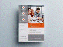
Before setting Out to create your effective flyer, it is important to have a full understanding of your target audience. This is because it is going to be the main determining factor for the design of your Flyer. Depending on your target audience, you are going to have to tailor the design flyer to suit them
Pay Attention to your Visuals
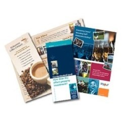
Images on a Flyer is what people tend to look at first, so it is vital that attention is given to the type of visuals that will be used in the flyer design. The aim of a flyer is to be an attention grabber, incorporating stand out visual images are also important to capture of your audience attention whilst using the visuals to set off an idea to what your flyer is about. Including bold and bright colours is also great for capturing the attention of your audience. If you want your flyer to covey a specific mood to your audience, we suggest that researching into the psychology of colours will offer you tips on how colours can be used to convey a certain message to your target audience
Be Clear About Your Benefits
Today’s consumer is generally busy and has no time to take in too much information. So, adding too much information to your flyer can destroy its effectiveness, it is best to try and convey the message within the images and fill in the gaps with words, as mentioned earlier note that people don’t have the time to read through lengthy text. To overcome the challenge of lengthy text, it is important to clearly list the benefits your product or service offers. Customer will easily find the reasons to give your business or event a try because they can clearly see the benefit they are going to be enjoy. To get further recognition we even advice you to add the benefits in a bolder font or add some colour around them.
Call To Action
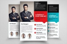
It is Vital to have a flyer with a clear call to action. You don’t want your reader getting interested and doing nothing after. Adding words within the flyer such as Order Now, Call Now or Log on to the Website, show your customers you want to help them and interact with them. So it is critical that you include your contact details so your potential clients can follow on and reach your business
Show That You are Organised
Finally, the last top tip is to keep your Flyer layout organised, how your flyer is designed can reflect on your business or event, so it is important to keep it as organised as possible. You can keep your flyer organised by adopting simple design layouts such as the use of Bullet Points and Text Boxes to help break the information into readable portions.
So! There we go your 5 basic tips to designing a flyer. Follow our top 5 tips today and transform your flyers into effective lead magnets for your business.
.png)

 -->
-->